
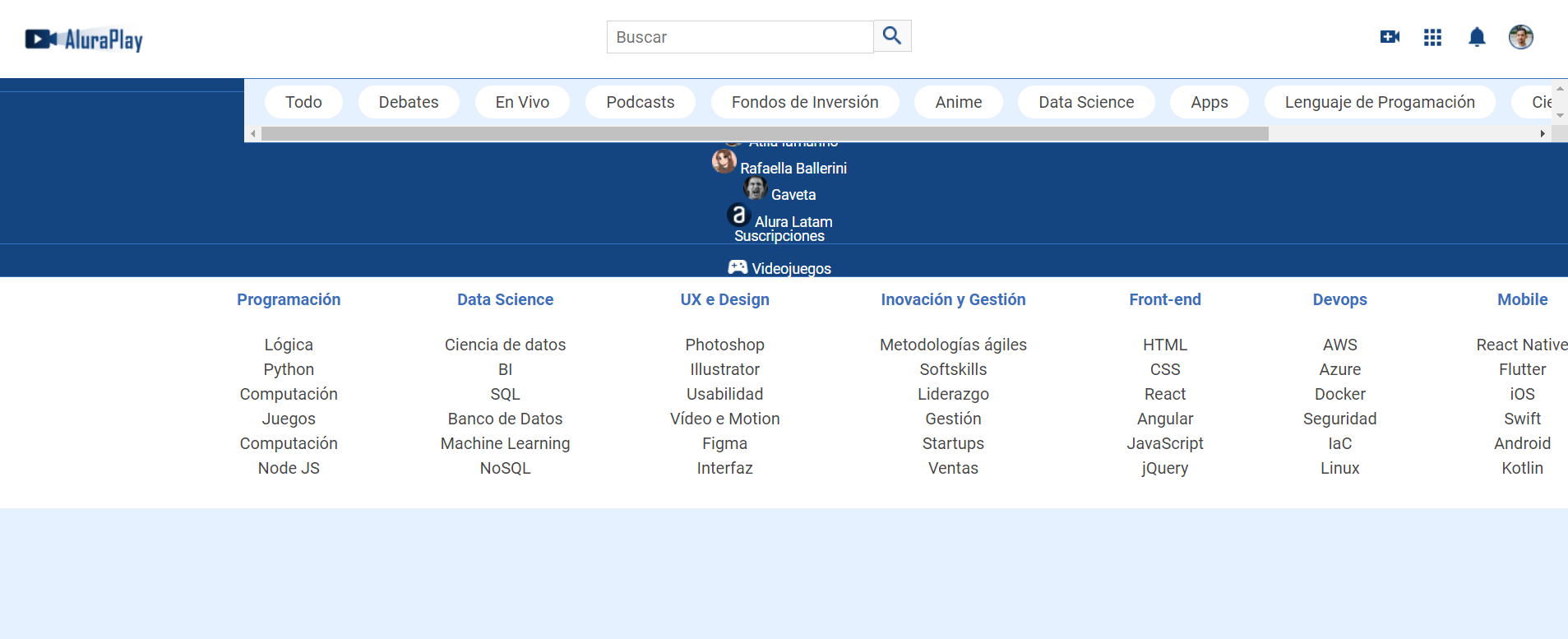
Tengo la duda, de que no me aparece el contenido de la instructora y modificando el CSS tampoco lo cambia. ¿Qué puedo hacer para mejorar mi código?
/* Cabecera */ .cabecera__container{ display: flex; justify-content: space-between; align-items: center; position: fixed; top: 0; }
.cabecera__buscar__item{ display:none; }
.menu_container{ position: fixed; bottom: 0%; height: 75px; width:100%; }
.menu__lista{ display: flex; flex-direction: column; justify-content: space-around; height: 100%; align-items: center; padding-top: 15px; }
.menu__lista li{ align-self: center; }
.menu_itens{ display: flex; flex-direction: column; gap: 5px; }
.menu__lista li:nth-child(2), .menu__lista li:nth-child(3), .menu__lista li:nth-child(4){ display: none; }
/* Seccion superior / .superior__seccion__container{ display: flex; align-items: center; white-space: nowrap; / alineación del texto para que no se rompa y este dentro del contenedor*/ overflow: scroll; gap: 15px; }
/* Rodapie / .rodapie__container{ display: flex; / flex-direction: column; flex-wrap: wrap;*/ flex-flow: column-wrap; }
@media (min-width:834px) { /* Cabecera */ .cabecera__buscar__item{ display: block; }
/* Rodapie */
.rodapie__container{
    justify-content: space-between;
}
}
/* MENU LATERAL PARA PANTALLAS DE TABLETS */
@media (min-width:834px) and (max-width: 1200px){ .menu__container{ position:fixed; bottom: 0%; height: 85%; width: 74px; } }