import pandas as pd
import matplotlib.pyplot as plt
import matplotlib.ticker as mtick
# 1. Colores institucionales
ROJO_1, ROJO_2, ROJO_3 = "#e23155", "#cc2c4e", "#b32742"
AZUL_1, AZUL_2, AZUL_3 = "#203f75", "#1c3867", "#19325b"
BLANCO, GRIS_1, GRIS_2, GRIS_3, GRIS_4, GRIS_5 = "#ffffff", "#ebebeb", "#d9d9d9", "#cccccc", "#555655", "#231f20"
AQUA_1, AQUA_2, AQUA_3 = "#addcd4", "#9fccc5", "#96bfb9"
# 2. Calcular facturación por región
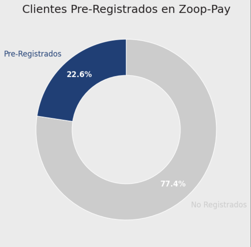
df['facturacion'] = df['precio_unitario'] * df['cantidad'] + df['envio']
facturacion_region = df.groupby('region')['facturacion'].sum().sort_values(ascending=False)
# 3. Crear figura
fig, ax = plt.subplots(figsize=(16, 9), facecolor=GRIS_1)
ax.set_facecolor(GRIS_1)
# 4. Crear gráfico de barras
bars = ax.bar(
facturacion_region.index,
facturacion_region.values,
color=AQUA_1
)
# 5. Título
ax.set_title('Facturación por región en 2023', fontsize=18, color=GRIS_5)
# 6. Quitar etiquetas de ejes
ax.set_xlabel('')
ax.set_ylabel('')
# 7. Personalizar ticks del eje X
ax.tick_params(axis='x', labelsize=12, colors=AZUL_1)
# 8. Formatear eje Y en millones, sin mostrar etiqueta
ax.tick_params(axis='y', left=False, labelleft=False) # oculta los ticks del eje Y
# 9. Etiquetas sobre cada barra (formato millones)
for bar in bars:
altura = bar.get_height()
ax.text(
bar.get_x() + bar.get_width() / 2,
altura,
f'MXN$ {altura/1e6:.2f} M',
ha='center',
va='bottom',
fontsize=12,
color=AZUL_1
)
# 10. Quitar bordes superiores y derechos, mantener izquierdo e inferior
for spine in ['top', 'right']:
ax.spines[spine].set_visible(False)
for spine in ['left', 'bottom']:
ax.spines[spine].set_visible(True)
ax.spines[spine].set_color(GRIS_5)
ax.spines[spine].set_linewidth(1)
# 11. Eliminar grid
ax.grid(False)
# 12. Mostrar gráfico
plt.tight_layout()
plt.show()
import pandas as pd
import matplotlib.pyplot as plt
# 1. Paleta de colores institucional
ROJO_1, ROJO_2, ROJO_3 = "#e23155", "#cc2c4e", "#b32742"
AZUL_1, AZUL_2, AZUL_3 = "#203f75", "#1c3867", "#19325b"
BLANCO, GRIS_1, GRIS_2, GRIS_3, GRIS_4, GRIS_5 = "#ffffff", "#ebebeb", "#d9d9d9", "#cccccc", "#555655", "#231f20"
AQUA_1, AQUA_2, AQUA_3 = "#addcd4", "#9fccc5", "#96bfb9"
# 2. Agrupar los datos
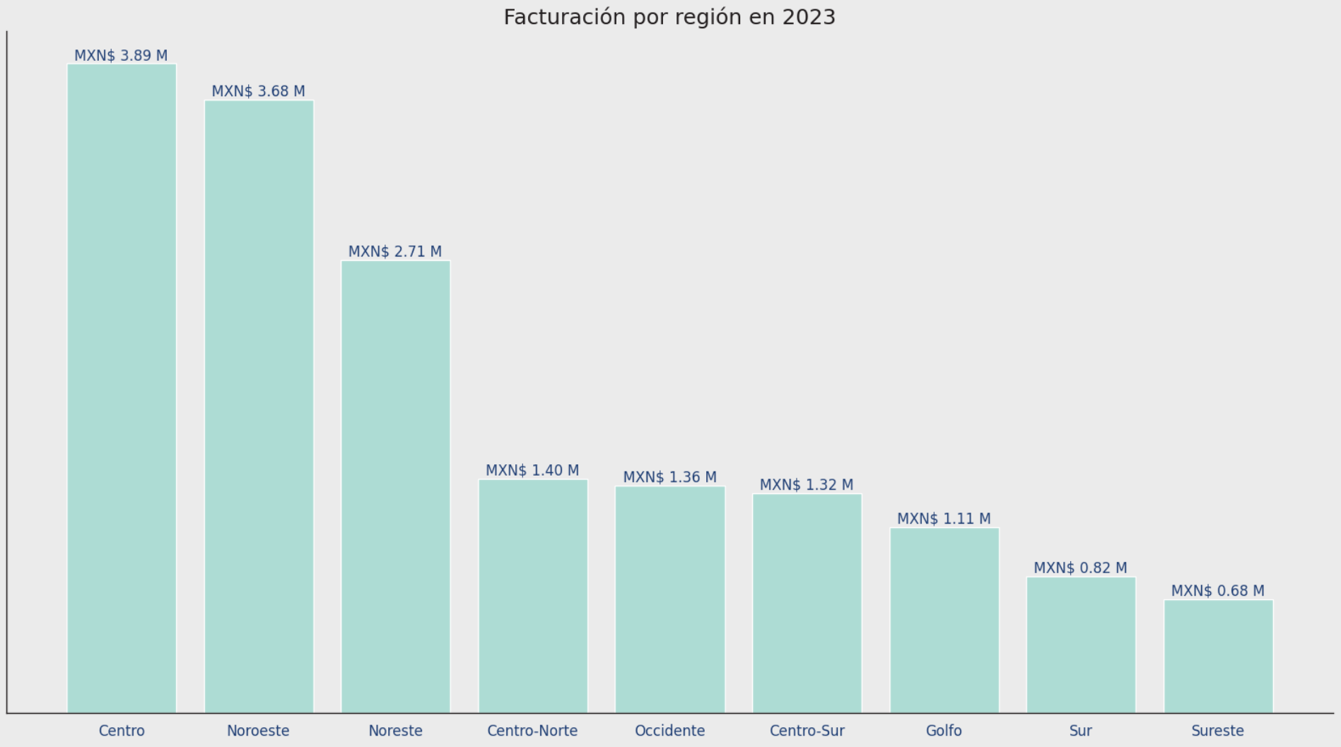
conteo_zoop = df_consolidada['zoop_pay'].value_counts()
etiquetas = ['Pre-Registrados' if x == 'sí' else 'No Registrados' for x in conteo_zoop.index]
colores = [AZUL_1 if x == 'sí' else GRIS_3 for x in conteo_zoop.index]
# 3. Crear figura
fig, ax = plt.subplots(figsize=(6, 6), facecolor=GRIS_1)
ax.set_facecolor(GRIS_1)
# 4. Crear gráfico de rosca
wedges, texts, autotexts = ax.pie(
conteo_zoop,
labels=etiquetas,
colors=colores,
startangle=90,
counterclock=False,
wedgeprops=dict(width=0.4),
autopct='%1.1f%%',
pctdistance=0.8,
textprops=dict(fontsize=12)
)
# 5. Estilo de etiquetas y porcentajes
for i, text in enumerate(texts):
text.set_color(colores[i]) # Etiqueta del segmento
text.set_fontsize(12)
for autotext in autotexts:
autotext.set_color(BLANCO) # Porcentaje en blanco
autotext.set_fontsize(12)
autotext.set_weight('bold') # Negrita
# 6. Título del gráfico
plt.title(
'Clientes Pre-Registrados en Zoop-Pay',
fontsize=18,
color=GRIS_5
)
# 7. Mostrar gráfico
plt.tight_layout()
plt.show()