
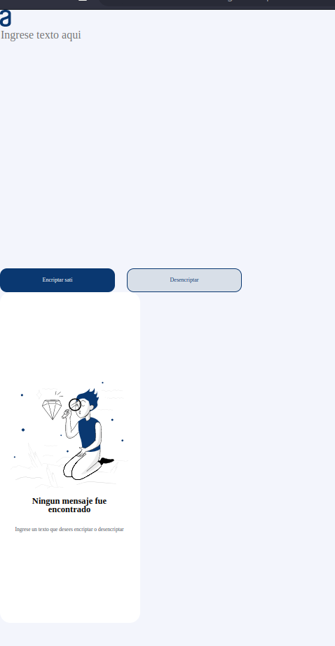
Buenas alguien me podría decir como hago para acomodar los elementos de mi pagina lo intente con (display: inline) pero no me sale
 código HTML
<!DOCTYPE html>
<html lang="es">
<head>
    <meta charset="UTF-8">
    <meta http-equiv="X-UA-Compatible" content="IE=edge">
    <meta name="viewport" content="width=device-width, initial-scale=1.0">
    <link rel="stylesheet" href="reset.css">
    <link rel="stylesheet" href="estilo.css">
    <title>Encriptado de texto</title>
</head>
<body>
    <header>
        <img src="logo.svg">
    </header>
    <main>
        <section class="entrada">
            <textarea type="text" autofocus placeholder="Ingrese texto aqui" cols="35" rows="18"></textarea><br>
            <button class="encriptar">Encriptar sati</button>
            <button class="desencriptar">Desencriptar</button>
        </section>
        <section class="salida">
            <div class="targeta">
                <img src="muñeco.svg">
                <h2>Ningun mensaje fue encontrado</h2><br>
                <p>Ingrese un texto que desees encriptar o desencriptar</p><br>
                <!-- <button>Copiar</button> -->
            </div>
        </section>
    </main>
    <script src="Encriptador.js"></script>
</body>
</html>
Código CSS
/* Fondo */
body {
    background-color: #f3f5fc;
}

/* Logo */
header img {
    /* margin: 40px 100px; */
}

/*Entrada de datos*/

main .entrada {
    /* position: absolute;
    top: 10%;
    left: 15%; */
    display: inline;
    max-width: 50%;
}

main .entrada textarea {
    color: #0A3871;
    background: #f3f5fc;
    font-size: 32px;
    font-family: 'Inter';
    border: none;
    resize: none;
}

main .entrada button {
    margin: 30px 30px 0 0;
    width: 328px;
    height: 67px;
    border: none;
    border-radius: 20px;
}

main .entrada .encriptar {
    color: #ffffff;
    background: #0A3871;
    font-family: 'Inter';
    font-style: normal;
    font-size: 16px;
    text-align: center;
}

main .entrada .desencriptar {
    color: #0A3871;
    background: #d8dfe8;
    font-family: 'Inter';
    font-style: normal;
    font-size: 16px;
    text-align: center;
    border: #0A3871 1px solid;
}

/*Salida de datos*/
main .salida {
    /* position: absolute;
    top: 5%;
    left: 75%; */
    display: inline;
    max-width: 50%;

}

main .salida .targeta {
    background: #ffffff;
    width: 400px;
    height: 944px;
    border-radius: 30px;
}

main .salida img, h2, p {
    position: relative;
    width: 336px;
    top: 16rem;
    left: 30px;
    padding:  0 0 20px 0;
}

main .salida h2 {
    text-align: center;
    font-family: 'Inter';
    font-size: 25px;
}

main .salida p {
    color: #495057;
    text-align: center;
    font-family: 'Inter';
    font-size: 15px;
}

/* Pantalla movil*/
@media screen and (max-width: 960px) {
    main .entrada, .salida {
        background: red;
        display: block;
        width: 100%;
    }
}
